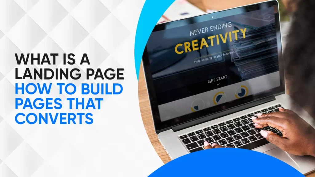
What is a Landing Page – How to Build Pages That Convert
November 21, 2025
| Khadija Raees | Reviewed by Haseeb Hamdani
Reading Time: 5 minutes
Jump To Section
- What Is a Landing Page in Digital Marketing?
- Why Landing Pages Are Important for Conversions
- Key Elements of a High-Converting Landing Page
- Different Types of Landing Pages Explained
- How to Build a Landing Page That Converts (Step-by-Step Guide)
- Design Hooks & Psychological Triggers That Increase Conversions
- Common Mistakes to Avoid
- How to Optimise Landing Pages for Better Conversion
- Why Wide Ripples Digital Inc. Is the Right Partner
- Quick FAQS
A landing page is one of the most powerful tools in digital marketing. If you’ve ever clicked on an ad, an email link, or a social post and landed on a page with one clear action (like signing up or buying something), you’ve already experienced a landing page.
Unlike a homepage, which introduces your business broadly. A landing page is designed with a single purpose: to convert visitors into leads or customers.
What Is a Landing Page in Digital Marketing?
A landing page is a standalone web page built for one campaign, service, or offer. These pages are designed to grab contact details like email addresses from interested users. In exchange, you offer something valuable, usually a lead magnet, like a free ebook, trial, or discount.
Its role is to guide visitors toward one specific action, such as:
- Signing up for a newsletter
- Downloading an ebook or guide
- Registering for a webinar
- Booking a consultation
- Purchasing a product
Landing Page vs Homepage: What’s the Difference?
- Homepage = general, with many links that cover everything.
- Landing Page = focused, single call-to-action (CTA), no distractions.
Why Landing Pages Are Important for Conversions
Landing pages are essential for conversion rate optimization (CRO). Businesses use them to:
- Increasing conversions means more leads and sales.
- Track campaign results like measure ad, email, or social media ROI.
- Match intent, deliver exactly what was promised in the ad or post.
- Move people through funnels. Step-by-step toward purchase.
Wide Ripples’ blog pages often use a 30-Day Free Trial callout in the sidebar. That’s a hook that reinforces the offer across their site. Companies with 30+ landing pages generate 7x more leads than those with fewer.
Key Elements of a High-Converting Landing Page
When you dig into the lead capture landing page article from Wide Ripples, you’ll see a clear structure, which is a subset (or variation) of general landing pages.
| Section | Purpose / Tips |
|---|---|
| Headline (Hero) | Big, benefit-driven, attention-grabbing |
| Subheadline | Clarifies the promise or value |
| Hero Image / Graphic / Video | Visual cue showing offer or outcome |
| Offer / Lead Magnet | Something valuable in exchange for contact (e.g. ebook, a checklist, a discount) |
| Concise & Persuasive Copy | Focus on benefits, keep it simple |
| Call-to-Action (CTA) | Bold button (e.g. “Download Now” / “Start Trial”) |
| Form (Lead Capture) | Only ask for essentials (like name + email) |
| Trust Signals | Testimonials, logos, ratings, certifications |
| Mobile & Speed Optimization | Fast load, responsive design |
| Traffic Drivers | Ads, social posts, SEO, UTM tags |
From the “Lead Capture” page, Wide Ripples also includes best practices such as mobile optimization, A/B testing, simplified UX, and using traffic-driving strategies.
Different Types of Landing Pages Explained
Not all landing pages are the same. Common types include:
- Lead Generation Landing Pages help in collecting contact details in exchange for value.
- Click-Through Pages lead to warm up visitors before checkout.
- Sales Pages are designed to sell a product or service directly.
- Event Landing Pages are for webinars, conferences, or workshops.
- Thank You Pages appear after someone signs up or buys.
How to Build a Landing Page That Converts (Step-by-Step Guide)
Here’s a step-by-step process that blends general best practices with lead capture insights from Wideripples’ guide:
- Define Your Goal
Decide: lead capture? sales? event registration? That helps shape the structure
- Know Your Audience
Understand their needs and challenges. What problem are they trying to solve? Speak in their language.
- Craft a Strong Headline
Promise value upfront. Use benefit-driven, clear, and emotional language.
- Decide Your Offer
For lead capture pages, this is critical. Ebook, free trial, discount, consultation.
- Write Benefit-Focused Copy
Show how you solve their pain points. Keep it short, address objections, use bullets, emphasize benefits.
- Design the Hero Section
You can use visuals, ensure contrast, and place CTA above the fold.
- Insert CTA and Form
Keep form fields minimal. Use strong CTA wording. For example, “Get My Free Guide” or “Start Trial Now.
- Add Trust Signals
Also, you can add Social proof, ratings, badges, charts, and client stories.
- Optimize for Mobile & Speed
Compress images, lazy load, and responsive layout. Quick loading, responsive design.
- Drive Traffic
Use ads, social, email, SEO, and tag links to measure source effectiveness. Paid ads and social media campaigns.
- A/B Test Variants
Try different headlines, button colors, images, CTAs, and layouts.
- Measure Results
Use Google Analytics, heatmaps, and conversion goals to see the bottleneck.
Design Hooks & Psychological Triggers That Increase Conversions
Here’s where psychology and design make a difference. At Wide Ripples Digital Inc., we use these advanced strategies. To make your landing pages stand out and convert better, here are advanced tactics you can adopt.
Hero Hooks & Offers Up Front
- Place your offer, like a free trial, discount, and bonus, right in the first screen (above the fold).
- Use language like “Start your 30-day free trial, no credit card required”.
- Use a question hook or bold promise: “Want 3× more leads in 30 days?”
- Exclusive Discount (10% off for first-time buyers)
- Urgency Hooks (Offer ends tonight)
Authority & Trust Building
- Showcase your Google GMP reviews, client ratings, or case study metrics prominently.
- Display trust badges, security seals, partner logos, and press mentions.
- Use charts or client results (before/after) to make your claims credible.
- Add charts, graphs, or results snapshots to prove impact.
- Show security badges, certifications, and partner logos.
Visual & UX Signals
- Use direction cues (arrows, gaze of a person in the image) pointing toward the CTA.
- Use contrasting colors to make the CTA stand out.
- Make sure every scroll position still reminds the user of the offer
- Mini-hero sections repeating CTA at intervals.
Landing Page Best Practices
- One Goal per Page and avoid multiple CTAs.
- Message Match, Ad copy, and landing page should align.
- Strong CTAs are important. Use action words like “Start Now.”
- Urgency and Limited offers boost action.
- Test everything from headlines to images.
- Fast Page Speed check. Each second of delay hurts conversions.
- Check the Mobile speed first, as most visitors arrive on mobile.
- Short Forms and information. Only ask for essentials.
- Social Proof Everywhere, like Reviews, case studies, and ratings.
Common Mistakes to Avoid
- Asking for too much info in forms.
- Too many CTAs or outbound links.
- No mobile optimization.
- Slow-loading pages.
- Copy focused only on features, not benefits.
- No authority or trust elements.
Examples of High-Converting Landing Pages
- Dropbox: Minimal, one CTA.
- Airbnb Host Signup: Benefit-driven, strong social proof.
- Shopify Free Trial: Clear offer, trust badges, short form.
How to Optimise Landing Pages for Better Conversion
Optimization never ends. Test and refine by:
- Running A/B tests (headlines, button colors, offers).
- Simplifying forms.
- Adding exit-intent popups.
- Using heatmaps and analytics.
- Personalizing content for user segments.
Why Wide Ripples Digital Inc. Is the Right Partner
Here’s why brands choose Wide Ripples:
- Proven Results. Our landing pages deliver higher conversions.
- Tailored Strategies. Each campaign gets a unique design.
- Authority & Trust. We use ratings, reviews, and trust elements to build credibility.
- Transparent Communication.
Quick FAQS
What is a landing page vs. a homepage?
A landing page has one CTA. However, a homepage covers multiple areas.
Why do I need a landing page?
It increases conversions by focusing visitor attention; you need an appealing and attractive landing page.
What makes a landing page effective?
A strong headline, clear offer, one CTA, social proof, and mobile optimization help to make the landing page effective.
Should I include navigation menus?
No, do not include; just keep users focused on the goal.
How do I test a landing page?
You can test your landing pages by using A/B testing tools and analytics to compare versions.
Disclaimer: The information provided in this blog is for general informational purposes only. For professional assistance and advice, please contact experts.
Search Here
More Categories
Latest Posts

February 26, 2026
Khadija Raees
February 24, 2026
Khadija Raees
February 19, 2026
Khadija Raees
February 17, 2026
Khadija Raees

February 12, 2026
Khadija Raees

About Author
Khadija Raees
Khadija Raees, a graduate in Computer Sciences, has five years of experience in SEO writing and content creation. She focuses on writing highly...
