5 Web Design Mistakes That Are Costing Your Business Conversions (And How to Fix Them)
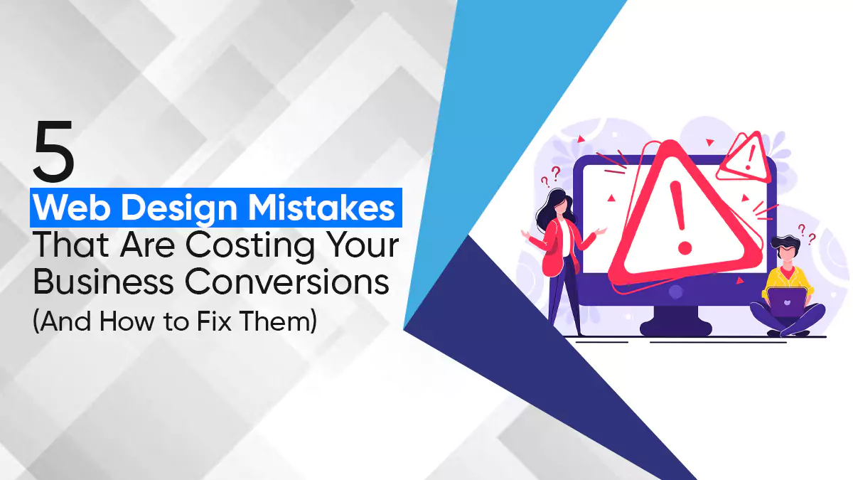
Your website might look good at first glance. But if it’s not turning visitors into leads or sales, something’s off. And often, it’s the design mistakes that are getting in the way.
According to research by GoodFirms, 73.1% of users say they’ll leave a website if it looks outdated or poorly designed.
That’s a lot of lost opportunities, just because of how things look and feel.
What’s worse? Many of these issues are easy to miss. You might not even realize they’re costing you conversions. But small tweaks can make a big difference.
Top 5 Website Design Mistakes
There are many website design mistakes that can cause low conversion rate but these 5 are the worst mistakes to make....
Mistake 1: Using CTA Colors That Blend In
Your call-to-action buttons (CTAs) are like signposts. They tell your visitors where to go and what to do next, whether that’s buying something, signing up for a free trial, or contacting your team.
But if your CTA buttons blend in with the rest of the page, people won’t notice them. That means fewer clicks, less engagement, and lost sales.
A study by HubSpot found that a red CTA button outperformed a green one by 21%, just because the red stood out more on the page.
How To Fix:
Use high-contrast colors that stand out from the rest of your design. If your website is mostly blue, go with a bold orange or yellow button. If your background is light, use darker buttons — and vice versa.
Also, think about what different colors make people feel.
- Red = urgency or excitement
- Green = action, positivity
- Orange = confidence
- Blue = trust
By picking the right color, you’re not just making your CTA pop, you’re also influencing how people feel when they see it.
Bonus tip: Make sure your CTA looks like a button, not just a piece of text. People should instantly know it’s clickable.

Mistake 2: Making Buttons That Are Too Small Or Too Big
Tiny buttons are hard to tap, especially on mobile. Oversized buttons? They can make your layout feel clumsy and unprofessional.
Here’s the thing: Over 55% of website traffic now comes from mobile devices (Statista, 2024). If your buttons don’t work well on a phone, you’re turning away more than half your visitors.
How To Fix:
Follow the 44x44 pixel rule, that’s the minimum recommended button size for touch screens, according to Apple’s Human Interface Guidelines and Google’s Material Design.
This size makes sure that even people with larger fingers can tap your buttons without trouble.
But size isn’t everything. Your button should also be:
- Easy to spot
- Not crammed between other clickable elements
- Aligned with your design, not too flashy, not too hidden
Think about how it looks and how it feels to use.
Mistake 3: Ignoring Your Audience’s Color Preferences
Color plays a big role in decision-making. Studies show that up to 90% of a user’s first impression is based on color alone (University of Winnipeg study).
If your colors don’t click with your audience, they might bounce before even reading your content.
How To Fix:
Start by understanding who you’re talking to. A younger, trendier crowd might respond well to bold, energetic colors like:
- Red
- Yellow
- Neon green
A more professional or older audience may prefer:
- Navy blue
- Soft gray
- Earth tones
Check what successful competitors in your space are doing. What colors are they using? How does it feel when you land on their site?
You can also use A/B testing to try different color schemes and see which gets better results. Tools like Google Optimize AB selector, Optimizely, or VWO can help with that.
It’s not about your taste, it’s about what makes your audience feel good, safe, and ready to take action.
Mistake 4: Not Optimizing for User Flow
When people land on your website, they should know where to go without thinking too hard. But many websites make this tough. They bury important info, use confusing menus, or throw too much at visitors all at once.
This messes with your user flow, the path someone takes from landing on your site to taking action. If that path is broken, people give up.
How To Fix:
First, keep your navigation simple. Use clear labels like “Pricing,” “Services,” or “Contact”, not fancy words that make people guess.
Use breadcrumb navigation so visitors know where they are. Break up content with headers so it’s easy to scan. Don’t overload the page. Each section should lead naturally to the next, like a story.
Every page should have one clear goal. Don’t distract people with too many buttons or choices.
And here’s a pro tip: do user testing. Sit down with real users, watch how they move through your site, and ask what confused them. You’ll be shocked at what you find.
Fix those pain points, and you’ll lower bounce rates and help more people make it to the finish line, whether that’s a sale, a signup, or a call.
Mistake 5: Forgetting Trust Factors to Boost Your Credibility
Here’s the thing: people don’t buy from websites they don’t trust. And trust doesn’t just magically happen, your site has to earn it.
If you’re missing trust signals, like testimonials, secure payment badges, or privacy policies, your site can feel sketchy, even if your product is great.
A report by Baymard Institute found that 18% of users abandon carts because they didn’t trust the website with their credit card info.
How To Fix:
Start by showing real testimonials. Not just a name and quote, add photos, locations, or even video if you can. Make it feel real.
Next, add trust badges, like "Verified by Visa," "SSL Secure," or payment icons like PayPal. These instantly make users feel safer.
If you have certifications or awards, show them off. Got good reviews on Google or Trustpilot? Link to them. These small touches go a long way.

And don’t forget a clear privacy policy. People want to know you’re not selling their data. It’s not just about compliance, it’s about building confidence.
When your site feels safe and legit, people are way more likely to stick around and hit that “Buy Now” button.
Read More: How To Create A High-Converting Lead Capture Landing Page
Why Optimizing Your Website Design for Conversions Matters
Getting people to visit your website is only half the job. The real win is turning those visits into sales, signups, or leads. That’s where conversion rate optimization comes in, and your website design plays a big part in it.
Let’s break down why optimizing your site’s design is a must if you want to grow your business and stop leaving money on the table.
1. You Save Money on Getting New Visitors
Bringing people to your site usually costs money, whether it’s through paid ads, SEO, or social media. If most of those visitors leave without doing anything, your marketing budget goes to waste.
Now, imagine your website is designed in a way that gets more people to take action, like clicking a CTA, filling out a form, or calling you. That means you don’t need to keep spending more money to get more visitors. You get more out of the traffic you already have.
Let’s say you spend $1,000 to get 1,000 visitors. If your site converts at 1%, you only get 10 leads. But if you improve your design and hit a 3% conversion rate, that same $1,000 now brings in 30 leads. Same traffic, triple the results.
That’s the power of smart design.
2. You Make the Sales Funnel Smoother
A good-looking website isn’t just for show. It helps people move through your funnel without getting lost or frustrated. The easier it is for them to find what they need, the more likely they are to take the next step.
If you’re trying to get 200 leads a month from 5,000 visitors, you need a conversion rate of 4%. But if your site only converts 1%, you’d need 20,000 visitors to hit that same number. That’s a massive jump in traffic and in cost.
Things like clear menus, simple layouts, eye-catching visuals, and strong CTAs help guide users smoothly. When people don’t have to think too hard, they convert more easily.
3. You Build a Better Reputation
According to research, it takes about 0.05 seconds for someone to form an opinion about your site . If your site looks outdated, messy, or hard to use, it reflects badly on your brand.
On the flip side, a clean, modern design makes your business look sharp and trustworthy. It tells visitors you care about quality and pay attention to detail.
This boosts credibility, which is huge when people are deciding whether to hand over their email, credit card, or time.
4. You Get More Sales From Warmer Leads
Your website isn’t like a cold call; the people landing there are already somewhat interested in what you offer. That makes them warmer leads. But if your site makes it hard for them to act, they’ll bounce.
A good design makes taking action feel easy. That could mean:
- Filling out a contact form
- Booking a call
- Buying a product
- Signing up for your newsletter
The smoother the process is, the more likely they are to finish it, and that means more sales, with less effort.
Ready to Turn Clicks Into Customers?
At Wide Ripples Digital, we help businesses build websites that work, not just look good.
Whether you need help with:
- Logo, Poster & Theme Design
- User-friendly UI/UX that keeps visitors engaged
- Custom Web Development that scales with your business
- Conversion Rate Optimization to turn more traffic into real leads and sales
We’ve got you covered.
We don’t believe in one-size-fits-all. We design, build, and optimize websites that match your brand and make it easy for your audience to take action.
Let’s fix the design mistakes holding your site back and turn your website into your hardest-working sales tool.
Get in touch with Wide Ripples Digital today.
Let’s create a site that sells.
Quick FAQs
What are common web design mistakes that affect conversions?
How can I fix bad website design to increase sales?
Why is my website not converting visitors into customers?
What are the top web design issues that lower conversion rates?
How can I improve my website design to boost conversions?
What are the most common web design errors affecting conversion rates?
How do I optimize my website for higher conversions?
What changes should I make to my website to increase sales?
How can a better website design help increase conversions?
Disclaimer: The information provided in this blog is for general informational purposes only. For professional assistance and advice, please contact experts.
Written by Khadija
Last updated April 24, 2025